Linear regression is about predicting a numerical \(y\) variable based on some \(X\) variables. Classification is about predicting a categorical \(y\) variable based on some \(X\) variables. For example,
- decide if an email spam or not based on the metadata and text of the message
- deciding if a patient has a disease or not
- predicting if someone is going to default on a load
- automatically recognizing letters in an image
- automatically tagging people’s face in a picture you upload to Facebook
All of these problems can be phrased as: build a map from some \(X\) data (images, medical records, etc) to some \(y\) categories (letters, yes/no, etc). To build intuition this lecture we will focus on binary classification (only two categories) and two dimensional data.
Classification is an example of supervised learning meaning have examples of the pattern we are tying to find (both \(X\) and \(y\) data). This is in contrast to unsupervised learning where you are trying to come up with a possibly interesting pattern (i.e. you only have \(X\) data, no pre-specified \(y\) data)
Setup and prerequisites
# package to sample from the multivariate gaussian distribution
library(mvtnorm)
# calculate distances between points in a data frame
library(flexclust)
# for knn
library(class)
library(tidyverse)
# some helper functions I wrote for this script
# you can find this file in the same folder as the .Rmd document
source('helper_functions.R')This lecture assumes you are familiar with
- vectors
- euclidean distance
- dot product
- multivariate Gaussian distribution
Notation
Suppose our \(X\) data has \(d\) numeric variables (e.g. if there are categorical \(X\) variables first convert them to dummy variables). Suppose our \(y\) variable has \(K\) categories (categories are also called classes or labels). For this lecture we assume \(K=2\) meaning we are doing binary classification.
Our goal is to build a map \(f(X) \to y\) mapping the \(X\) data to categories. To build this map we are given training data: suppose we have \(n\) training observations \((\mathbf{x}_1, y_1), \dots, (\mathbf{x}_n, y_n)\). The picture you should have in your head is a data frame that is \(n \times d + 1\) where \(d\) of the columns are numbers and one of the columns are labels.
## # A tibble: 3 x 4
## is_spam number_exclaimation_marks contains_viagra
## <fctr> <dbl> <dbl>
## 1 yes 10 1
## 2 yes 13 0
## 3 no 1 0
## # ... with 1 more variables: sender_credibility_score <dbl>It is often convenient to encode the classes in different ways. For binary classification common encodings include
- 0/1
- 1/-1
- positive/negative
The first two are numerical and the last on is meant to be categorical. In your head you should think of these encodings as just labeling different categories.
[TODO maybe add y/x version of emails]
Some definitions
- linearly separable classes
- unbalanced classes
Some additional notational details. We have \(n\) training points in total. Let \(n_+\) be the number of training points in the positive class and \(n_-\) be the number of training points in the negative class (i.e. \(n = n_+ + n_-\)).
Some toy examples
Having some basic geometric intuition can go a long way in machine learning. Below are some two dimensional toy examples you should keep in the back of your head when you think about classification. The code to generate these figures is in the .Rmd document and the script helper_functions.R in the same folder.
In the first four examples the data in each class are generated from the multivariate normal distribution.
Spherical Gaussian point clouds
This is the quintessential two class example. The two class are drawn independently from 2-dimensional Gaussian distributions with identity covariance matrices (i.e. spherical Gaussian point clouds). The means differ between classes: (-1, 0) for the negative class and (1, 0) for the positive class.

Spherical Gaussian point clouds, seperable
The observed training data are linearly separable meaning we can draw a line that perfectly separates the two classes1. This example should be “easy” meaning a reasonable classifier should do a pretty good job accurately classifying the data. The data are distributed the same as above, but now the classes means are further apart.

Skewed Gaussian point clouds
The data are again Gaussian with different class means, however, the covariance matrix is no longer the identity. Both classes have the same covariace matrix.

Gaussian X
The data are Gaussian, but now both the class means and class covariance matrices differ.

Gaussian mixture model
Each class is generated from a mixture of 10 Gaussian distributions. The mixture means for each class are themselves drawn from a Guassian whose mean is (1, 0) for the negative class and (0, 1) for the positive class. This distribution is the example from section [TODO] of ISLR.

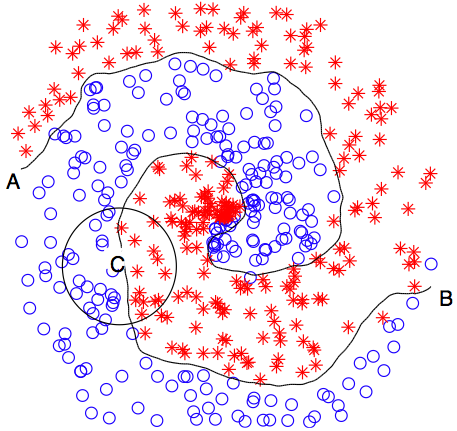
Boston Cream
The data are draw from a distribution such that one class encircles the other class. See the .Rmd file for details of the specific distribution.

Nearest Centroid
The nearest centroid classifier (NC) is one of most simple yet powerful classifiers (also underrated judging from the brevity of the Wikipedia entry…). It is also called the Mean Difference classifier for reasons that should make sense in about 5 minutes.
The principle of sufficiency in statistics says we should build algorithms off simple yet meaningful summaries of our data. Probably the most simple way of summarizing a set of data is with the mean. The nearest centroid says you should classify a data point to the class whose mean is closest to that data point (centroid is another word for mean).
Pseudo code
Writing the nearest centroid procedure out a little more explicitly
- given the training data compute the class means
- \(\mathbf{m}_{+} = \frac{1}{n_+} \sum_{i \text{ s.t. } y_i = +1}^{n_+} \mathbf{x}_i\)
- \(\mathbf{m}_{-} = \frac{1}{n_-} \sum_{i \text{ s.t. } y_i = -1}^{n_-} \mathbf{x}_i\)
- given a new test point \(\mathbf{\tilde{x}}\) compute the distance between \(\mathbf{x}\) and each class mean.
- compute \(d_+ = ||\mathbf{x} - \mathbf{m}_{+}||_2\) (where \(||\cdot||_2\) means euclidean distance)
- compute \(d_- = ||\mathbf{x} - \mathbf{m}_{-}||_2\)
- classify \(\mathbf{x}\) to the class corresponding to the smaller distance.
- find the smaller of \(d_+\) and \(d_-\)
Computing the the class means \(\mathbf{m}_{+}, \mathbf{m}_{-}\) corresponds to “training” the classifier.
Programtically
Let’s walk through using the nearest centroid classifier to classify a test point. Suppose our training data are the first example above and we have a new test point at (1, 1).
# test point
x_test <- c(1, 1)
First let’s compute the class means
# compute the observed class means
obs_means <- data_gauss %>%
group_by(y) %>%
summarise_all(mean)
obs_means## # A tibble: 2 x 3
## y x1 x2
## <fctr> <dbl> <dbl>
## 1 -1 -1.151583 0.12338380
## 2 1 1.147330 -0.09823948
Now compute the distance from x_test to each class mean
# grab each class mean
mean_pos <- select(filter(obs_means, y==1), -y)
mean_neg <- select(filter(obs_means, y==-1), -y)
# compute the euclidean distance from the class mean to the test point
dist_pos <- sqrt(sum((x_test - mean_pos)^2))
dist_neg <- sqrt(sum((x_test - mean_neg)^2))
# distance to positive class mean
dist_pos## [1] 1.108078# distance to negative class mean
dist_neg## [1] 2.323309
The test point is closer to the positive class so we predict that \(y_{test}\) is the positive class.
Now that we have the nearest centroid classification procedure let’s look at it’s predictions for a lot of points. There are two functions you may not have seen before: expand.grid and apply.
First let’s make a grid of test points.
# make a grid of test points
test_grid <- expand.grid(x1 = seq(-4, 4, length = 100),
x2 = seq(-4, 4, length = 100)) %>%
as_tibble()
test_grid## # A tibble: 10,000 x 2
## x1 x2
## <dbl> <dbl>
## 1 -4.000000 -4
## 2 -3.919192 -4
## 3 -3.838384 -4
## 4 -3.757576 -4
## 5 -3.676768 -4
## 6 -3.595960 -4
## 7 -3.515152 -4
## 8 -3.434343 -4
## 9 -3.353535 -4
## 10 -3.272727 -4
## # ... with 9,990 more rowsNow let’s get the prediction for each test point. First compute the distance between each test point and the two class means. The decide which class mean each test point is closest to.
# compute the distance from each test point to the two class means
# note the use of the apply function (we could have used a for loop)
dist_pos <- apply(test_grid, 1, function(x) sqrt(sum((x - mean_pos)^2)))
dist_neg <- apply(test_grid, 1, function(x) sqrt(sum((x - mean_neg)^2)))
# add distance columns to the test grid data frame
test_grid <- test_grid %>%
add_column(dist_pos = dist_pos,
dist_neg = dist_neg)
# decide which class mean each test point is closest to
test_grid <- test_grid %>%
mutate(y_pred = ifelse(dist_pos < dist_neg, 1, -1)) %>%
mutate(y_pred=factor(y_pred))
test_grid## # A tibble: 10,000 x 5
## x1 x2 dist_pos dist_neg y_pred
## <dbl> <dbl> <dbl> <dbl> <fctr>
## 1 -4.000000 -4 6.459005 5.011564 -1
## 2 -3.919192 -4 6.394793 4.966080 -1
## 3 -3.838384 -4 6.330962 4.921503 -1
## 4 -3.757576 -4 6.267522 4.877857 -1
## 5 -3.676768 -4 6.204487 4.835168 -1
## 6 -3.595960 -4 6.141867 4.793461 -1
## 7 -3.515152 -4 6.079677 4.752762 -1
## 8 -3.434343 -4 6.017929 4.713098 -1
## 9 -3.353535 -4 5.956637 4.674493 -1
## 10 -3.272727 -4 5.895816 4.636976 -1
## # ... with 9,990 more rowsFinally let’s plot the predictions
## Warning: Removed 1 rows containing missing values (geom_point).
NC is a linear classifier
Based on the above plot you might guess that the nearest centroid classifier is a linear classifier i.e. it makes predictions by separating the plane into two categories with a line. You can convince yourself that the NC classifier is a linear classifier using some basic geometric arguments.
In higher dimensions a linear classifier picks a hyperplane to partition the data space.  .
.
A hyperplane is given by a normal vector \(\mathbf{w} \in \mathbb{R}^d\) and an intercept \(b \in \mathbb{R}\) (recall we have \(d\) variables i.e. the data live in \(d\) dimensional space). The hyperplane is perpendicular to the normal vector \(\mathbf{w}\) and it’s position is given by the intercept \(b\). In particular a hyperplane is given by the points \(\mathbf{x}\) in \(\mathbb{R}^d\) that satisfy \(\mathbf{x}^T\mathbf{w} + b\) i.e. \[H = \{\mathbf{x} \in \mathbb{R}^d | \mathbf{x}^T\mathbf{w} + b = 0\}\] where \(\mathbf{x}^T\mathbf{w}\) is the dot product between the two vectors \(\mathbf{x}\) and \(\mathbf{w}\).
In the plot below the arrow points along the direction of the normal vector and the solid line shows the separating hyperplane.

It turn out NC finds the hyperplane perpendicular to the two class means that is half way between them. In the plot below we replace the normal vector direction with the line segment going between the two class means.

It’s not too hard to see that the NC normal vector is given by the different between the two class means i.e. \[\mathbf{w} = \mathbf{m}_{+} - \mathbf{m}_{-}\] with a little algebra we can find the intercept is given by \[b= - \frac{1}{2}\left(||\mathbf{m}_{+}||_2 - ||\mathbf{m}_{-}||_2 \right)\] This is where nearest centroid get’s it’s synonym mean difference!
Suppose we are given a new \(\mathbf{\tilde{x}}\) and we want to compute the predicted \(\tilde{y}\). We now do the following
- Compute the discriminant \(f = \mathbf{w}^T \mathbf{\tilde{x}} + b\).
- Compute the sign of the discriminant \(\tilde{y}=\text{sign}(f)\).
In other words we classify \(\tilde{y}\) to the positive class if \(\mathbf{w}^T \mathbf{\tilde{x}} + b >0\) and to the negative class if \(\mathbf{w}^T \mathbf{\tilde{x}} + b < 0\).
Toy examples
Let’s fit the NC classifier on each of the toy data examples above. We plot the predictions for points in the plane and give the training error rate

Training error rate for point clouds: 0.1125.

Training error rate for separable point clouds: 0

Training error rate for skewed point clouds: 0.065

Training error rate for heteroscedastic point clouds: 0.15.

Training error rate for GMM: 0.41.

Training error rate for Boston cream: 0.475.
K-nearest-neighbhors
Another simple yet effective classifier is k-nearest-neighbors (KNN). You select \(k\) and provide training data. KNN predicts the class of a new point \(\tilde{\mathbf{x}}\) by finding the \(k\) closest training points to \(\tilde{\mathbf{x}}\) then taking a vote of these \(K\) points’ class labels. For example, if \(k=1\) KNN finds the point in the training data closes to \(\tilde{\mathbf{x}}\) and assigns \(\tilde{\mathbf{x}}\) to this point’s class.
KNN is a simple yet very effective classifier in practice. There are two important differences between KNN and NC:
- KNN is not a linear classifier
- KNN has a tuning parameter (k) that needs to be set by the user
These are both a blessing and a curse. Non-linear classifiers have the ability to capture more complex patterns. For example, the Boston Cream example and these three examples should convince you that linear classifiers are not always the right way to go (1, 2, 3). In high-dimensions even more complicated an pathological things might be happening (e.g. see the manifold hypothesis). Furthermore, tuning parameters generally give a classifier more flexibility.
Flexibility and expressiveness can be a good thing, however,
there is no free lunch
i.e. there are always trade-offs. For example, the more flexible a classifier is (i.e. the more tuning parameters is has) the more sensitive that classifier is to overfitting. Complexity is not necessarily a good thing! In fact much of machine learning is about finding a balance between simplicity and complexity. For more discussion on this see discussions about the bias-variance tradeoff in any ML textbook (e.g. ISLR section 2).
In the context of KNN balancing the bias-variance trade-off means selecting the right value of \(k\). This is typically done using cross-validation which will be discussed later.
computing KNN (math)
Computing KNN is fairly straightforward. Assume we have fixed \(k\) ahead of time (e.g. \(k=5\)).
For a new test point \(\tilde{\mathbf{x}}\) fist compute the distance between \(\tilde{\mathbf{x}}\) and each training point i.e. \[d_i = ||\tilde{\mathbf{x}} - \mathbf{x}_i||_2 \text{ for } i = 1, \dots, n\]
Next sort these distances and find the \(k\) smallest distances (i.e. let \(d_{i_1}, \dots, d_{i_k}\) be the \(k\) smallest distances).
Now look at the corresponding labels for these \(k\) closest points \(y_{i_1}, \dots, y_{i_k}\) and have these labels vote (if there is a tie break it randomly). Assign the predicted \(\tilde{y}\) to the winner of this vote.
computing KNN (code)
Suppose \(k = 5\) and we have a test point \(\tilde{\mathbf{x}} = (1, 1)\).
k <- 5 # number of neighbors to use
x_test <- c(0, 1) # test point
Compute the distance between \(\tilde{\mathbf{x}}\) and each training point. Note the function dist2 from the flexclust package does this for us.
# grab the training xs and compute the distances to the test point
distances <- train_data %>%
select(-y) %>%
dist2(x_test) %>% # compute distances
c() # this solves an annnoying formatting issue
# print first 5 entries
distances[0:5] ## [1] 1.17677223 3.17954493 0.09772573 2.28397117 1.87472240Now let’s sort the training data points by their distance to the test point
# add a new column to the data frame and sort
train_data_sorted <- train_data %>%
add_column(dist2tst = distances) %>% # the c() solves an annoying formatting issue
arrange(dist2tst) # sort data points by the distance to the test point
train_data_sorted## # A tibble: 400 x 4
## x1 x2 y dist2tst
## <dbl> <dbl> <fctr> <dbl>
## 1 0.06540233 0.9702020 -1 0.07187061
## 2 -0.02383795 1.0947738 1 0.09772573
## 3 -0.14322246 1.1610164 -1 0.21549703
## 4 0.07268305 1.2348212 1 0.24581256
## 5 0.09913570 0.7579408 1 0.26157322
## 6 0.12200396 0.7609176 1 0.26841264
## 7 0.27122239 0.8741936 1 0.29897967
## 8 -0.25188510 0.7747962 1 0.33787996
## 9 -0.30499744 0.8273767 1 0.35046004
## 10 0.35008260 1.1037569 -1 0.36513465
## # ... with 390 more rowsNow select the top \(k\) closest neighbors
# select the K closest training pionts
nearest_neighbhors <- slice(train_data_sorted, 1:k) # data are sorted so this picks the top K rows
nearest_neighbhors## # A tibble: 5 x 4
## x1 x2 y dist2tst
## <dbl> <dbl> <fctr> <dbl>
## 1 0.06540233 0.9702020 -1 0.07187061
## 2 -0.02383795 1.0947738 1 0.09772573
## 3 -0.14322246 1.1610164 -1 0.21549703
## 4 0.07268305 1.2348212 1 0.24581256
## 5 0.09913570 0.7579408 1 0.26157322
Now have the \(k\) nearest neighbors vote.
# count number of nearest neighors in each class
votes <- nearest_neighbhors %>%
group_by(y) %>%
summarise(votes=n())
votes## # A tibble: 2 x 2
## y votes
## <fctr> <int>
## 1 -1 2
## 2 1 3Decide which class has the most votes.
# the [1] is in case of a tie -- then just pick the first class that appears
y_pred <- filter(votes, votes == max(votes))$y[1]
y_pred## [1] 1
## Levels: -1 1So we decide to classify \(y\) to the positive class.
test_df <- tibble(x1=x_test[1], x2=x_test[2], y=y_pred)
ggplot(data=data_gauss) +
geom_point(aes(x=x1, y=x2, color=y, shape=y), alpha=.2) + # training points
geom_point(data=test_df, aes(x=x1, y=x2, color=y, shape=y), shape="X", size=6) + # training points
geom_point(data=nearest_neighbhors, aes(x=x1, y=x2, color=y, shape=y), size=2) +
theme(panel.background = element_blank())
Toy examples
Now let’s look at the prediction grid for the toy examples. Again we are using \(k = 5\).
# make a test grid
test_grid <- expand.grid(x1 = seq(-5, 5, length = 100),
x2 = seq(-5, 5, length = 100)) %>%
as_tibble()
# we have to split the training data into an x matrix an y vector to use the knn function
train_data_x <- train_data %>% select(-y)
train_data_y <- train_data$y # turn into a vecotr
# compute KNN predictions
# the knn function is from the class package
knn_test_prediction <- knn(train=train_data_x, # training x
test=test_grid, # test x
cl=train_data_y, # train y
k=5) # set k
knn_test_prediction[0:5]## [1] -1 -1 -1 -1 -1
## Levels: -1 1And compute the training error
knn_train_prediction <- knn(train=train_data_x, # training x
test=train_data_x, # test x
cl=train_data_y, # train y
k=5) # set k
# training error ate
mean(train_data_y != knn_train_prediction)## [1] 0.1025
Training error rate for point clouds: 0.1025.

Training error rate for separable point clouds: 0.

Training error rate for skewed point clouds: 0.0075.

Training error rate for heteroscedastic point clouds: 0.0675.

Training error rate for GMM: 0.185.

Training error rate for Boston Cream: 0.005.
KNN code
Luckily KNN has already been coded up in the class package. The code below computes the KNN predictions for k = 5 on the test grid.
# we have to split the training data into an x matrix an y vector to use the knn function
train_data_x <- train_data %>% select(-y)
train_data_y <- train_data$y # turn into a vecotr
# the knn function is from the class package
predictions <- knn(train=train_data_x, # training x data
cl=train_data_y, # training y labels
test=test_grid, # x data to get predictions for
k=5) # set k
predictions[0:5]## [1] -1 -1 -1 -1 -1
## Levels: -1 1In this example the training data are separable, but the general case is not separable. There is a positive probability that the two classes will not be separable i.e. if we drew enough points we would not be able to separate the two classes.↩